Quick Overview
I created a website for a trendy florist in order to create a seamless shopping experience. Why? Because there is no simple way to choose from a variety of flowers from current online shops while having a pleasant experience and receiving flowers on time. How? Let us explore.
If you don’t want to read the entire story, here’s a link to the slides presentation deck.
Process
As it was a completely solo-personal project, my responsibilities included all the way from UX research, UI design, Usability testing to even UX writing as well. I applied all the things I learned in the Google UX design professional certificate program. More on that later, let’s start with the case study. Design Thinking framework that was used for building this case study.
Empathise > Define > Ideate > Prototype > Test
???? Understanding The Users
I conducted a survey, hallway testing and interviews to understand the user needs. To identify user groups, I formed individual & aggregated empathy maps using which I made personas with their user stories and user journey maps.
Research Findings
02 -Group Interviews conducted while Hallway Testing
02 -Individual Interviews conducted online
05 -Survey Responses collected
The research yielded conflicting results regarding my initial assumptions about online shopping, pricing, and delivery standards. It also provided me with additional insights such as a lack of information, a quasi checkout process, and many others.
I went to a well-known street with lots of flower shops to take the hallway tests, a lot of people typically visit that location. I questioned a few of the individuals there. For the individual interviews, I asked members of my family, and I utilized Facebook to run some surveys.
I initially believed there weren’t any online flower delivery services, but it turned out that a small number of people had discovered some possibilities, but they were either prohibitively expensive to order, had extremely small collections, or provided scant information on the flowers.
I asked questions like..
How often do buy flowers?
What do you like and dislike the most about the experience?
How do you check for quality?
Do you find online flowers shops?
What do you think of the concept of ordering flowers online?
What will make you trust the place you are ordering from?
I got replies like..
“Need information about the flower I’m buying”
“Usually a check for reviews and ratings but if there are photos it would be really helpful…”
“I would love to order flowers online..”
User Research Pain Points
There aren’t enough online flower stores from which to choose.
The delivery timing may not be reliable because it is occasionally time-bound.
Empathy Mapping, Personas & User Journey Mapping
I made two aggregated empathy maps from each of the 6 active participants’ individual empathy maps to generate my user personas and their user stories. In the current example, I mapped their user path to check for any edge circumstances.
I discovered two user groups: one is made up of individuals who lead busy lives and wish to get flowers online for special occasions. And then another group includes those who enjoy having flowers delivered to their homes.
We should now give them names! We’ll refer to the first user group as Emily, a young busy professional; the second as Kate, a housewife with three children living in a wealthy neighborhood. Check out my journey maps and personas to learn more about them.


???? Defining a clear problem
Problem Statement
Emily is a busy freelance graphic designer who needs an easy way to order flower online which offers variety and timely delivery because she wants to send a unique bouquet of flowers as a gift to her best friend’s wedding.
???? Ideating possible solutions
I made a hypothesis and did brainstorming exercises like How Might We..? and Crazy 8s followed by a detailed competitive analysis to come up with lots of different ideas.
Hypothesis Statement
I believe being able to order flowers online with guaranteed on time delivery and more description about the items (flowers) would solve Emily’s problem.
Competitive Analysis
I did a detailed competitive analysis of the key competitors in the Brazil market. I made a spreadsheet and a report of the same to record my findings.The reason for not doing a competitive analysis before the brainstorming activities was to not get influenced by any existing designs and to make use of the natural creativity.

???? Starting the design
[Goal st, User Flows, Storyboards, IA, Paper Wireframes, Digital Wireframes, Low-fidelity Prototype]
Goal Statement
Users of the website will be able to order flowers online, which will benefit those who wish to take advantage of the ease of doing so by ensuring prompt delivery and a user interface with plenty of images and product information. The number of website visitors and orders will be used to gauge the effectiveness of our efforts.
This will ultimately benefit the florist by boosting sales, maintaining a lucrative business, and providing an all-around pleasing user experience.
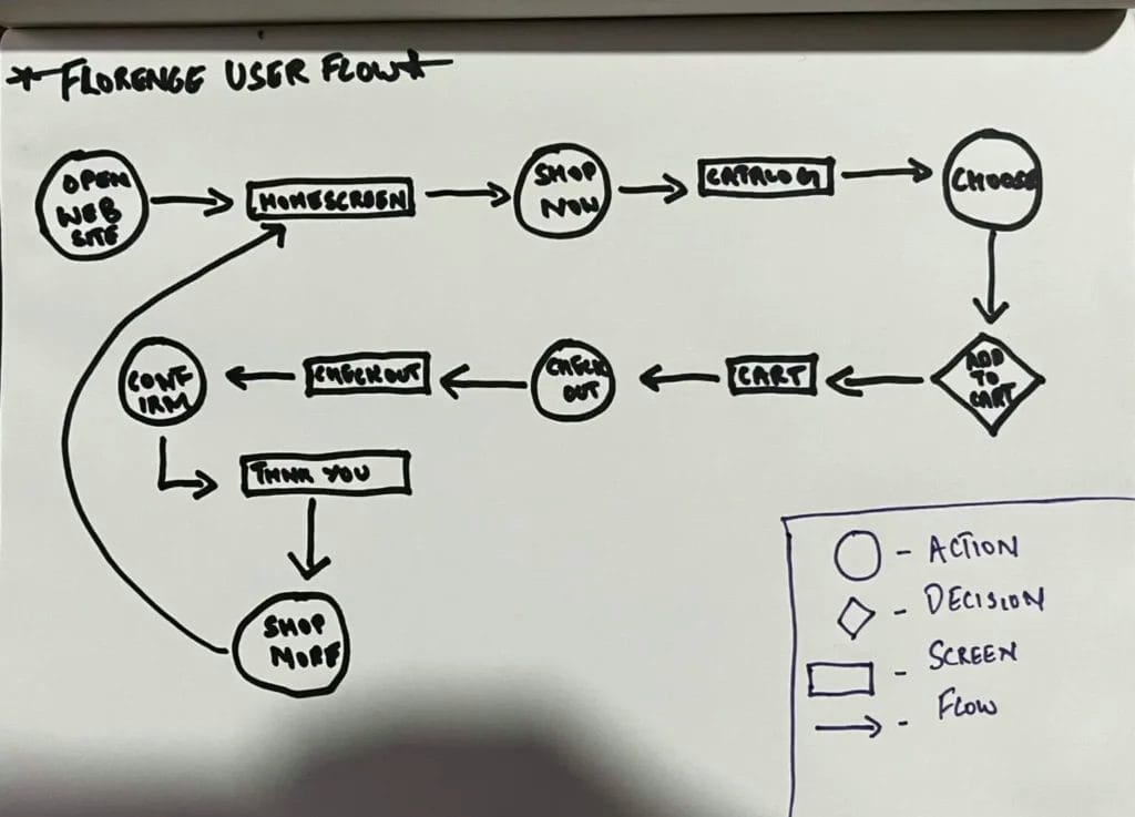
User Flow
I made a user flow based on all the finding until now.
Storyboards
Keeping our primary persona in mind, I sketched a big-picture and a close-up storyboard to visualize their journey with our website.
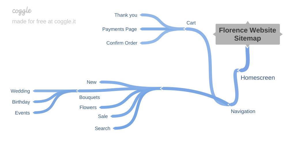
Information Architecture
Designed a basic sitemap considering the primary user flow.
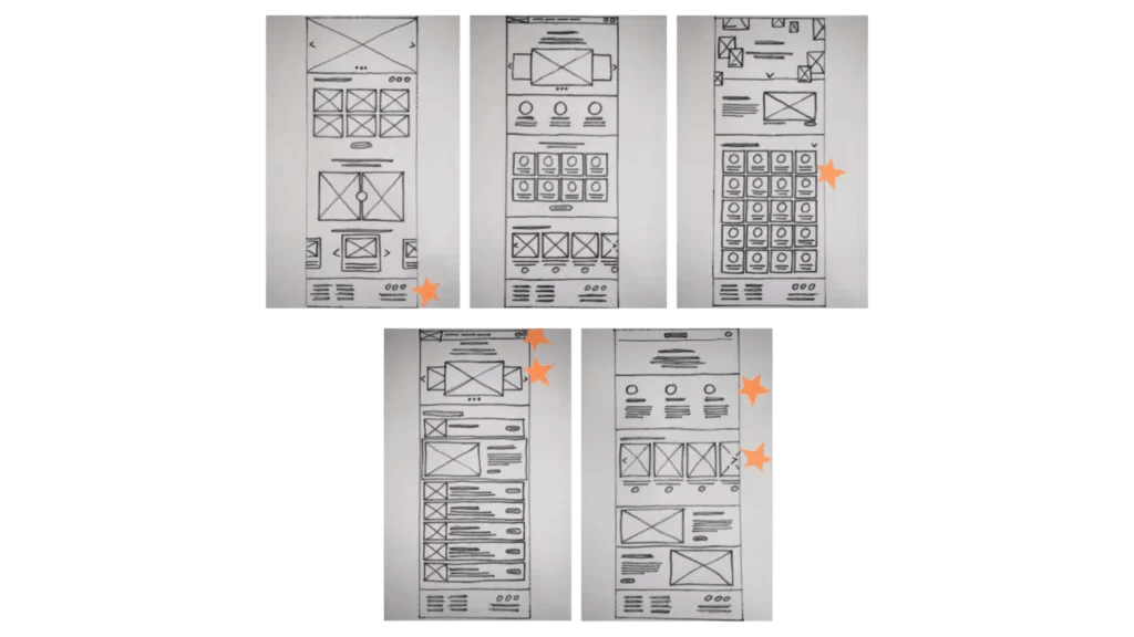
Iterating with Paper Wireframes
For deciding layouts and the task flow, I sketched multiple options for the screens on paper.
Digital Wireframes & Low-fi Prototype
Figma link of the low-fidelity prototype

???? Testing early concepts
I tested my low-fi prototype using a carefully designed moderated usability research with four participants. In order to identify trends and themes, I used spreadsheet note-taking and affinity diagrams to examine the results. I modified the prototype based on the information gathered and ran a second round of testing. Finally, I presented the research findings.
Research study involved four stages: Plan > Conduct > Analyze > Present
Planning the research study
The plan for this research study includes seven stages:
Project Background
Research Goals
Research Questions
KPIs
Methodology
Participants
Script
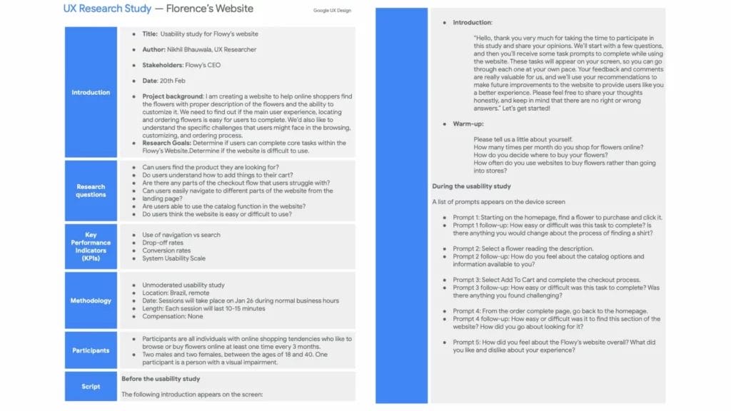
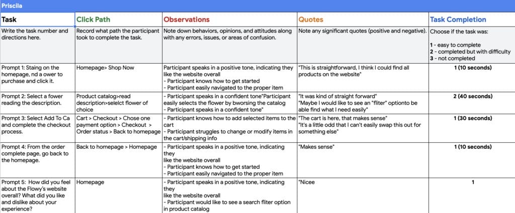
Conducting the usability study
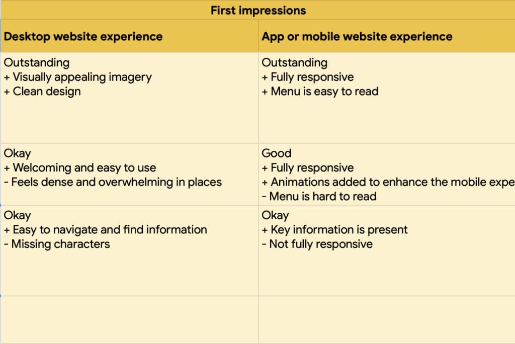
I conducted moderated usability testing with four participants using simple tasks, which helped me identify major points of confusion in my design. In fact, all of the participants became frustrated at the same points, which is why I decided not to continue with more participant testing and instead make some changes to the design. After analysing the findings and making design changes, I conducted round two testing with two of the previous participants and discovered that the changes I made were successful.
Analysing & synthesising the findings
Based on the video recordings and scribbled notes from the interviews, I created a detailed spreadsheet to collect and organise information in one place. Then, on digital sticky notes, I condensed these detailed notes into brief ones to create an affinity diagram in order to find patterns and themes in the user experiences.

Modifying the design
For a second round of testing, I prioritised the insights as P0 and P1, and made minor changes at the points of confusion. And the changes were effective! At this point, I realised the significance of conducting early testing with a low-fi prototype.
Links for the low-fidelity prototype version 1 and low-fidelity prototype version 2

Presenting the findings
This slide deck contains five brief sections about study details, themes, insights, recommendations, revisions & next steps.
✍ Refining the final designs
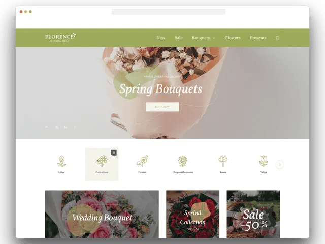
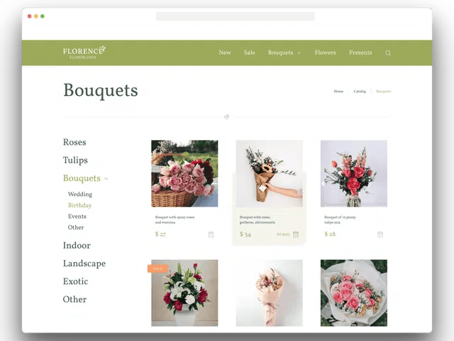
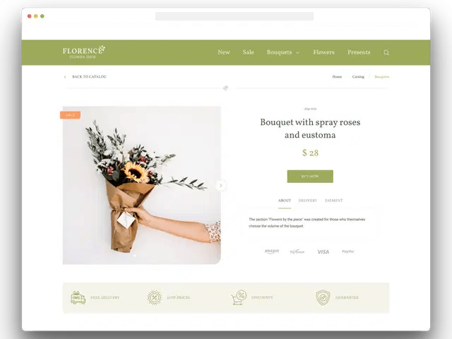
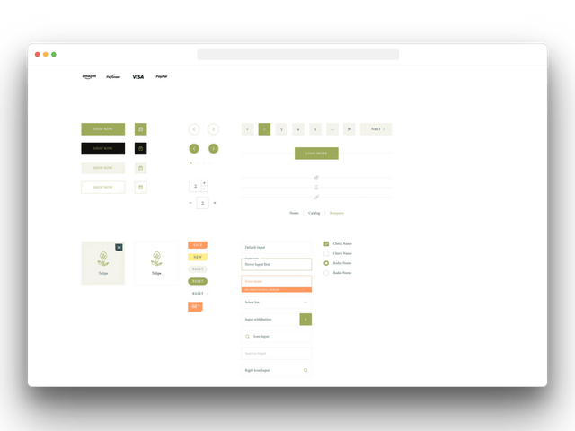
I created high fidelity mockups based on the refined wireframes. I worked on visual design elements such as typography, colour, and layout to create a detailed high fidelity prototype. To streamline my workflow and keep my designs consistent, I created a Sticker sheet in Figma for all of my UI elements.
Link of the final high-fidelity prototype.
Accessibility Considerations
-I designed the site with alt text available on each page for smooth screen reader access
-I used landmarks to help users navigate the site, including users who rely on assistive technologies
-I used headings with different sized text for clear visual hierarchy
-Colour contrasts that pass WebAIM WCAG norms
???? Summary
I empathise with users, define the problem, and brainstormed potential solutions. Along the way, I realised that one of the most important jobs of a UX designer is to understand the world through the eyes of the user. Empathy includes a focus on accessibility, which is a critical component of designing for everyone. Following that, I drew wireframes on paper and created them digitally in Figma. Then I entered the design process’s prototype phase. You saw my designs in action after I built the first low-fidelity prototype. I also discovered the significance of ethics in the field of UX design. Below you can see my final mockups.